Tuesday, 7 December 2010
Monday, 6 December 2010


Sunday, 5 December 2010
FRONT COVER FLAT PLAN
Annotation of Front Cover Flatplan NOTE: Unfortunately Scribd has compressed my notes about the skyline slightly so here is what it says: A convention often used to feature artist - stands out easily as it becomes a seperate part of the cover. I plan to use the skyline for my slogan.
FRONT PAGE ANALYIS
 Before creating our own front cover, we studied different types of front pages such as Q and Vibe. Their use of conventions are different to their own to suit their target audience and genre of music. We also discussed the general conventions most magazine companies use on their front covers such as a central image, masthead, barcodes, busswords, lures and headings.
Saturday, 4 December 2010
CONTENTS PAGE PHOTOGRAPHY
Photography contents page
This powerpoint presentation shows you some of the photos I used to create the contents page
This slideshare is a continuation of photos I took for the contents page
CONTENTS PAGE FLAT PLAN

When I approached the stage to actually design and create the contents page, I decided to make some changes in the layout fittingly so everything would fit and look good. Now, the text/information is on the right and the main image has been split into four large images. I believe with those two changes, the contents page look more attractive than planned.
POWER POINT PRESENTATION - FEATURES PAGE PITCH
Features page
After presenting my powerpoint to my class, I asked my fellow students to give me their opinion of it. I created a table of results on Microsoft Word and then uploaded online.
Pitching Features Page Audience Feedback
Pitching Features Page Audience Feedback
PHOTOGRAPHY SESSION
Today, I went to take some photographs that may be useful for my music magazine features page.
Later, we experimented with colour lighting with purple and red, following the house colours.
Later, we experimented with colour lighting with purple and red, following the house colours.
PHOTOGRAPHS EDITED
After taking the photographs, I went on the computer and used the software Adobe Photoshop to edit the photos. Below are some examples and I am pleased with many of them. I hope I may use some of them in my music magazine at one point.
FEATURES PAGE FLATPLAN


However, because of implications of the choice of photo (and because of the pose not suitable for the above flatplan), the amount of text to be placed on the features page, I changed the features page slightly. I decided to stay with the most conventional layout with image on the left and text on the right design.
Friday, 3 December 2010
FEATURES PAGE MINDMAP

Please click on image to enlarge
I plan to create my brand identity with my house colours of purple and red, and my masthead logo which will appear on the folio as well as the front cover. I will also be using a majority of sans-serif typefaces with only a few exceptions for serif fonts.
Thursday, 2 December 2010


Tuesday, 9 November 2010
IDEALOGY OF MY MUSIC MAGAZINE
I have decided my music magazine was to fill a gap in the current music industry. I have not generally seen any magazines that features unsigned bands therefore I will base my magazine on talented musicians that are still 'making it there'. Music has always been very popular with the youths of any generation so I believe this market will be a very good opportunity.
Ultimately, the magazine will be for young adults and teenagers who are interested in a niche music genre. The magazine is to aid those who wants to get a record label signed as well as a massive print-based forum for the musicians to communicate to each other as well sharing common interests. I also think the magazine idea would be good as the young generation of today are less interested in reading so publishing a magazine like this encourage them to read more.
The aim will generally to be featuring unsigned bands but there will be features and reviews done by successful artists that relates to the music genre which I have not decided yet.
SURVEY MONKEY ANALYSIS
print scren suvey
write underneath why you produced this questionnaire and what yu have discovered from this reserach
Although we have collected data from the questionnaire I handed out previously, I decided to use SurveyMonkey.com so gain more information from my target audience. SurveyMonkey a very useful website which allows you to create surveys and ask the digital world questions. Using SurveyMonkey is faster and favoured as it is done virtually and requires no printing paper or asking people to get a pen out to fill in the questions. Not only that, SurveyMonkey allows you to spread the word by using Facebook, Twitter, Myspace and other popular social networks.
READER PROFILE
 Before creating my reader profile I went on ipcadvertising.com to look at other music magazine reader profiles to investigate what well-known magazines' readerships are like. NME and UNCUT had a similar sense of style and music but UNCUT was a more classic music magazine whilst NME was more modern.
 I have decided to call my magazine name Notions of Music (NOM). This is because 'nom' is modern slang for teenagers and young people for the sound of eating. It is used not only for eating but in general talk for my target audience. Due to this fact, it is quite fitting to use this acronym so that my target audience have something to relate with and find it quite amusing. Of course, what NOM stands for has to be authentic. 'Notions of Music', basically translates to the 'ideas of music'. I think this was a good title as my magazine is supposedly made about unsigned artists and bands so new ideas about music are gathered. The logo I created shows a purple strip going across the motif to represent the (main) house colour. It is a simple logo that is sleek and modern which is what my target audience preferred when I did my SurveyMonkey.
Saturday, 6 November 2010
QUESTIONNAIRE RESEARCH
Now that we have completed our Preliminary Task of creating pages of a school magazine, we have done a questionnaire asking 15 people about general ideas about music and how they use it as well as music magazines. This is so that I am preparing to create my final task.
What age group do you fit in?
14 and under: 0
15-18: 12
19-22: 2
23-25: 0
26-29: 0
30+: 1
This question is very important as each age group generally enjoy different things and have different ideas. The amount of teenagers who filled in the questionnaire shows that the answers following, are generally based on what teenagers enjoy.
 Are you male or female?
Male: 5
Female: 10
Another question that will help us understand who these answers will belong to. It shows that the majority of the people who filled in the questionnaire are female and therefore will affect the results of the questionnaire. Over 65% of most music magazines have male readers.
What is your occupation?
Student: 13
Full-time job: 1
Part-time job: 1
Having a majority of students as answers depicts what students generally prefer in music taste and the way of gaining music.
What type of genre do you enjoy listening to?
Any: 3
Rock: 6
Metal: 1
Pop: 2
RnB: 1
Indie: 2
Name your top five bands/artists
This has proven hard to analyse as every person who answered each had a very different taste in music, even within the same genre because each genre has several sub-genres in between and now artists are enthusiastic in creating interesting new sub-sub-genres. This only shows how big the music industry is and how it may grow infinitely into the future. Below are all the bands and artists that were mentioned.
Rammstein: 1 Bauhaus: 1 X-ray-spex: 1 Killing Joke: 1 Black Sabbath: 1
My Chemical Romance: 1 Enter Shikari: 1 Greenday: 3 Lost Prophets: 1
You Me At Six: 1 Boys Like Girls: 1 Einaudi: 1 Nickelback: 1 3 Doors Down: 1
Katy Perry: 4 Bruce Springstein: 1 The Wanted: 1 Robbie Williams: 1
Take That: 4 The Script: 6 Pixie Lott: 3 Fleetwood Mac: 1 Yellowcard: 1
Reliant K: 1 Matt Nathanson: 1 Motion City Soundtrack: 1 Linkin Park: 1
Dashboard Confessional: 1 The Beatles: 3 Counting Crew: 1 Something Corporate: 1
Train: 1 Maroon 5: 4 Cold Play: 1 Mika: 1 The Noisettes: 1 Billy Joel: 1
The Hoosiers: 1 Rolling Stones: 1 Rhianna: 2 Bruno Mars: 1 Beyonce: 5
Eminem: 2 JLS: 1 N-Dubz: 1 Tiny Tempa: 1 Avril Lavigne: 2
Marina and the Diamonds: 1 Ellie Goulding: 1 Lady Gaga: 1
 When was the last time you bought a music CD?
A week ago: 2
2 weeks ago: 0
A month ago: 1
6 months ago: 2
1 year ago: 6
Over a year ago: 4
When was the last time you bought a music track?
This week: 5
Last Week: 3
2 weeks ago: 2
Last month: 2
6 months ago: 1
1 year ago: 1
Over a year ago: 1
When getting music, do you usually purchase music or use an alternate way to gain music?
Purchase: 8
Alternate: 7
Do you read music magazines? If yes, please state one or more magazines you read.
 Yes: 4 -> Kerrang x3 and Metalhammer x1
No: 11
Do you read magazines in any genre? If yes, please state one or more magazines you read.
Yes: 5 -> Glammour/MarieClaire x1, Gossip x1, Look x1, Chemistry World x1, Grazia x1
No: 8
 Do you prefer owning the music or using programs like Spotify?
Owning the music: 11
Using other programs to access music such as Spotify: 4
 How do you listen to your music?
iPod: 7
Computer: 5
Phone: 1
MP3: 2
What age group do you fit in?
14 and under: 0
15-18: 12
19-22: 2
23-25: 0
26-29: 0
30+: 1
This question is very important as each age group generally enjoy different things and have different ideas. The amount of teenagers who filled in the questionnaire shows that the answers following, are generally based on what teenagers enjoy.
 Are you male or female?
Male: 5
Female: 10
Another question that will help us understand who these answers will belong to. It shows that the majority of the people who filled in the questionnaire are female and therefore will affect the results of the questionnaire. Over 65% of most music magazines have male readers.
What is your occupation?
Student: 13
Full-time job: 1
Part-time job: 1
Having a majority of students as answers depicts what students generally prefer in music taste and the way of gaining music.
What type of genre do you enjoy listening to?
Any: 3
Rock: 6
Metal: 1
Pop: 2
RnB: 1
Indie: 2
Name your top five bands/artists
This has proven hard to analyse as every person who answered each had a very different taste in music, even within the same genre because each genre has several sub-genres in between and now artists are enthusiastic in creating interesting new sub-sub-genres. This only shows how big the music industry is and how it may grow infinitely into the future. Below are all the bands and artists that were mentioned.
Rammstein: 1 Bauhaus: 1 X-ray-spex: 1 Killing Joke: 1 Black Sabbath: 1
My Chemical Romance: 1 Enter Shikari: 1 Greenday: 3 Lost Prophets: 1
You Me At Six: 1 Boys Like Girls: 1 Einaudi: 1 Nickelback: 1 3 Doors Down: 1
Katy Perry: 4 Bruce Springstein: 1 The Wanted: 1 Robbie Williams: 1
Take That: 4 The Script: 6 Pixie Lott: 3 Fleetwood Mac: 1 Yellowcard: 1
Reliant K: 1 Matt Nathanson: 1 Motion City Soundtrack: 1 Linkin Park: 1
Dashboard Confessional: 1 The Beatles: 3 Counting Crew: 1 Something Corporate: 1
Train: 1 Maroon 5: 4 Cold Play: 1 Mika: 1 The Noisettes: 1 Billy Joel: 1
The Hoosiers: 1 Rolling Stones: 1 Rhianna: 2 Bruno Mars: 1 Beyonce: 5
Eminem: 2 JLS: 1 N-Dubz: 1 Tiny Tempa: 1 Avril Lavigne: 2
Marina and the Diamonds: 1 Ellie Goulding: 1 Lady Gaga: 1
 When was the last time you bought a music CD?
A week ago: 2
2 weeks ago: 0
A month ago: 1
6 months ago: 2
1 year ago: 6
Over a year ago: 4
When was the last time you bought a music track?
This week: 5
Last Week: 3
2 weeks ago: 2
Last month: 2
6 months ago: 1
1 year ago: 1
Over a year ago: 1
When getting music, do you usually purchase music or use an alternate way to gain music?
Purchase: 8
Alternate: 7
Do you read music magazines? If yes, please state one or more magazines you read.
 Yes: 4 -> Kerrang x3 and Metalhammer x1
No: 11
Do you read magazines in any genre? If yes, please state one or more magazines you read.
Yes: 5 -> Glammour/MarieClaire x1, Gossip x1, Look x1, Chemistry World x1, Grazia x1
No: 8
Owning the music: 11
Using other programs to access music such as Spotify: 4
 How do you listen to your music?
iPod: 7
Computer: 5
Phone: 1
MP3: 2
Friday, 5 November 2010
RESEARCH INTO TYPOGRAPHY
In Typography, we were shown the ten commandants of typography in print based media (by Paul Felton.
Felton displays both the "right" and "wrong" ways to typography which will play a big part in our magazine creations as it acts a convention to follow in print design.
I decided to study some type fonts so I went on www.dafont.com and looked at sans-serif and serif typefaces. Below are a list of fonts I found.

Wednesday, 3 November 2010
PRELIMINARY TASK EVALUATION
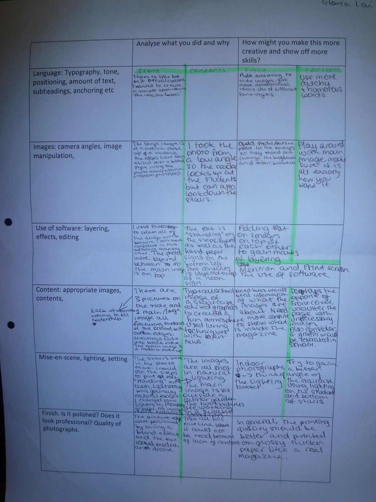
In my evaluation, I decided my aim was to make the design as simple as possible to achieve the contemporary style. I also used black and white to give the page the cool and calm look and mixing my house colours blue and yellow to give the page an identity (brand identity).
The photographs I used were all taken by me with a digital camera for best quality and the editing was completed on Adobe Photoshop CS3 which professionally enhances the pictures to the best possible. The main image on my front cover is a student standing with a piece of paper. I created the mise-en-scene with the school garden with students there in the background to relate to the magazine as it is a school magazine. The use of direct mode of address allows the reader’s eye to meet with the image and gain interest.
The three photos I used on the side were images telling the reader what maybe included in the issue. The photos were all taken in school for the setting and relation to be real. I also tried to use different camera angles such as medium close up, extreme close up, long shot and extreme long shot.
The photos were blended into the black background by using Photoshop and adjusted if needed (lighting, colour..etc).
I decided to use sans-serif fonts to gain the best attention of readers as sans-serif typefaces are bold and informative. I designed the slogan and masthead to be mixed together to give a clever effect as I think the slogan is always printed in small. Having the masthead in the navy blue and the slogan then standing out in yellow whilst sitting on the masthead is a visual effect I created.
To improve this piece of work, I should have added anchoring to the images, explaining what they are and how they have relation to the magazine. I should have also considered adding lures and buzzwords to capture the reader’s attention better.
Contents Page
The use of visual effects played a big part to “colourising” my contents page, making it bright and attractive. I used Photoshop to add the typical image of a school, having a lot cartoon doodles and paint as well as the school’s initials “HGS” in the school/house colours.
I decided to revolve my contents page within one big photo. This meant that I placed my text and information where my image allowed it. In my case, I took a picture of two students standing by the stairs. The actual contents information would sit on the steps of the stairs and the ‘look out for…’ section would be where the image was too dark/no use. I had to take addition photos of models holding out their arms, grasping a piece of white A4 paper. This allowed me to use Photoshop to add on whatever text I desired on the ‘piece of paper’ they were holding.
Since the edited image produced eye-catching results, I had to make sure the text and information on my contents page had to stand out just as much. I made use of my house colours as yellow is a vibrant colour already. To enhance the results, I outlined the text with black and white creating a colourful effect. In addition, making my text stand in all capitals made them look bolder. I titled the text backwards attempting to create a 3-D effect rather than the text just floating on the steps. I also added shadows to the text to make it look as if it was standing on the steps.
IDEALOGY & RESEARCH OF SCHOOL MAGAZINES
After researching several different school-related magazines, I can understand there are different magazines that can offer a variety of different things. However, they all have something in common: achievement and success. I hope that my preliminary task can give the same attention to detail when it comes to awards and accomplishments.
BRAND IDENTITY
Brand Identity is a convention that is special to each magazine institute. To have a brand identity allows your readers to recognise your magazine specifically in an unique way. This is especially important as many media products, especially music magazines can become similar. To ensure the magazine's readership and new readers remember, a brand indentity is can be anything that is a specific aspect and special to their magazine only.
When creating a magazine, it is essential that a well built brand identity is created to guarantee readers to keep buying. A brand identity appears in every issue of the magazine, offering the readers their little piece of difference to reading. Brand identity should never be changed once set as it would confuse faithful readers or it might change the whole outlook of the magazine because one of the main points that people remember is changed.
Although the brand identity can be "anything that sells", it is usually something that relates to the magazine's target audience. House colours are one convention to emphasise brand recognition. By basing the brand identity on the target audience, the target audience can relate themselves to the magazine which would make it more likely for them to purchase the magazine again.
For example, if you base your house colours on the target audience's stereotype, you could use their favourite colours. If the stereotype was the scene "emo" type, you may link the colours to black and red as well as neon colours but you would also use grunge and quite dark imagery in the themes and layout throughout the magazine. Brand Identity is not only based on house colours. Typography, language style and use of images can also be brand identity.
Tuesday, 2 November 2010


QUESTIONNAIRE RESSEARCH
We have done a questionnaire asking 15 people about general ideas about music and how they use it as well as music magazines.
What age group do you fit in?
14 and under: 0
15-18: 12
19-22: 2
23-25: 0
26-29: 0
30+: 1
Are you male or female?
Male: 5
Female: 10
What is your occupation?
Student: 13
Full-time job: 1
Part-time job: 1
What type of genre do you enjoy listening to?
Amy: 3
Rock: 6
Metal: 1
Pop: 2
RnB: 1
Indie: 2
Name your top five bands/artists
This has proven hard to analyse as every person who answered each had a very different taste in music, even within the same genre because each genre has several sub-genres in between and now artists are enthusiastic in creating interesting new sub-sub-genres. This only shows how big the music industry is and how it may grow infinitely into the future. Below are all the bands and artists that were mentioned.
Rammstein: 1 Bauhaus: 1 X-ray-spex: 1 Killing Joke: 1 Black Sabbath: 1
My Chemical Romance: 1 Enter Shikari: 1 Greenday: 3 Lost Prophets: 1
You Me At Six: 1 Boys Like Girls: 1 Einaudi: 1 Nickelback: 1 3 Doors Down: 1
Katy Perry: 4 Bruce Springstein: 1 The Wanted: 1 Robbie Williams: 1
Take That: 4 The Script: 6 Pixie Lott: 3 Fleetwood Mac: 1 Yellowcard: 1
Reliant K: 1 Matt Nathanson: 1 Motion City Soundtrack: 1 Linkin Park: 1
Dashboard Confessional: 1 The Beatles: 3 Counting Crew: 1 Something Corporate: 1
Train: 1 Maroon 5: 4 Cold Play: 1 Mika: 1 The Noisettes: 1 Billy Joel: 1
The Hoosiers: 1 Rolling Stones: 1 Rhianna: 2 Bruno Mars: 1 Beyonce: 5
Eminem: 2 JLS: 1 N-Dubz: 1 Tiny Tempa: 1 Avril Lavigne: 2
Marina and the Diamonds: 1 Ellie Goulding: 1 Lady Gaga: 1
When was the last time you bought a music CD?
A week ago: 2
2 weeks ago: 0
A month ago: 1
6 months ago: 2
1 year ago: 6
Over a year ago: 4
When was the last time you bought a music track?
This week: 5
Last Week: 3
2 weeks ago: 2
Last month: 2
6 months ago: 1
1 year ago: 1
Over a year ago: 1
When getting music, do you usually purchase music or use an alternate way to gain music?
Purchase: 8
Alternate: 7
Do you read music magazines? If yes, please state one or more magazines you read.
Yes: 4 -> Kerrang x3 and Metalhammer x1
No: 11
Do you read magazines in any genre? If yes, please state one or more magazines you read.
Yes: 5 -> Glammour/MarieClaire x1, Gossip x1, Look x1, Chemistry World x1, Grazia x1
No: 8
Do you prefer owning the music or using programs like Spotify?
Owning the music: 11
Using other programs to access music such as Spotify: 4
How do you listen to your music?
iPod: 7
Computer: 5
Phone: 1
MP3: 2
Monday, 11 October 2010
PHOTOGRAPHY WORK
In class, we have been taught a variety of skills concerning media such as photography and typography. Photography, we were introduced several terms and differences of zoom (medium close up, low angle..etc) that might depict a certain meaning. We were given cameras and set in groups to spend 20 minutes taking photos around the school to experiment shots.
Sunday, 10 October 2010
Friday, 1 October 2010
ANALYISING MAGAZINE COVER


These are two front covers (Rocksound and NME) that I anotated. They gave me a good idea of what two similar magazines have in difference. Rocksound looks like it is aimed at a slightly younger audience (majority of teens) than to NME (teens and adults). Although they are both quite similar, NME has a more clean, organised look, whereas Rocksound looks more cluttered in the sense that, not everything is placed so that it is evenly spread out. Their front images are also taken differently, NME has posted Paramore so that Hayley Williams, the main singer, also the only girl, to stand closer and in the middle of the page with the boys at the back. Rocksound has all 4 members standing together, with the more casual 'improvise' pose. Their shot is also more zoomed in than NME's.
Gloria<3
Thursday, 23 September 2010
BRIEF INTRODUCTION
Hi and welcome to my blog.
I anticipate this blog will be able to show the progress of my AS Media coursework which is worth 50% of my AS. It should be able to show clear evidence of progress by screenprints, scans, powerpoint presentations, videos and any form of media that should help me explain to you what I have done.
I hope I will be able to keep up with my blog as well as you, the reader, will enjoy following or read one-off this blog.
P.S. I picked out a decent layout hopefully that will go well with this blog, I hope you like it too!